Bivariate analysis in R involves analyzing the relationship between two variables.
To perform bivariate analysis, you can perform operations like finding the correlation coefficient, performing regression, and creating visualizations like scatter plots.
In this article, we will explore how to perform bivariate analysis in R.
Step 1: Load Required Libraries
To begin, load the necessary libraries. Here, we use the tidyverse library, which is required for further use.
library(tidyverse)
Step 2: Load Dataset
You can load an in-built dataset or create a dataframe to perform bivariate analysis on it. Here’s an example of how to create a dataframe:
# Create data frame
df <- data.frame(Machine_name=c("A","B","C","D","E","F","G","H"),
                 Pressure=c(12.39,11.25,12.15,13.48,13.78,12.89,12.21,12.58),
                 Temperature=c(78,89,85,84,81,79,77,85),
                 Status=c(TRUE,TRUE,FALSE,TRUE,FALSE,FALSE,TRUE,FALSE))

print(df)
Output: 👇️
  Machine_name Pressure Temperature Status
1            A    12.39          78   TRUE
2            B    11.25          89   TRUE
3            C    12.15          85  FALSE
4            D    13.48          84   TRUE
5            E    13.78          81  FALSE
6            F    12.89          79  FALSE
7            G    12.21          77   TRUE
8            H    12.58          85  FALSE
In the code above, we have defined a dataframe with four columns: Machine_name, Pressure, Temperature, and Status.
Step 3: Correlation Analysis
Let’s find the correlation between two columns of the dataframe using the cor() function:
# Calculate correlation coefficient
c <- cor(df$Pressure, df$Temperature)

# Display correlation coefficient
print(c)
Output: 👇️
[1] -0.3579008
Here, the output shows the correlation between the Pressure and Temperature columns of the dataframe.
Step 4: Regression Analysis
To perform linear regression analysis, you can use the lm() function:
# Fit simple linear regression model
l <- lm(Pressure ~ Temperature, data=df)

# Calculate summary of linear regression model
s <- summary(l)

# Display summary of linear regression model
print(s)
Output: 👇️
Call:
lm(formula = Pressure ~ Temperature, data = df)

Residuals:
     Min       1Q   Median       3Q      Max
-0.87778 -0.55523 -0.08842  0.38541  1.10292

Coefficients:
            Estimate Std. Error t value Pr(>|t|)
(Intercept) 18.23874    6.02198   3.029   0.0231 *
Temperature -0.06866    0.07313  -0.939   0.3840
---
Signif. codes:  0 ‘***’ 0.001 ‘**’ 0.01 ‘*’ 0.05 ‘.’ 0.1 ‘ ’ 1

Residual standard error: 0.8061 on 6 degrees of freedom
Multiple R-squared:  0.1281,	Adjusted R-squared:  -0.01722
F-statistic: 0.8815 on 1 and 6 DF,  p-value: 0.384
In this example, we perform linear regression on the dataframe.
Step 5: Visualization
To show the correlation between columns of the dataframe, you can plot a scatter chart using the plot() function:
# Create scatterplot of Pressure vs. Temperature
plot(df$Pressure, df$Temperature, pch=16, col='steelblue',
     main='Pressure vs. Temperature',
     xlab='Pressure', ylab='Temperature')
Output: 👇️
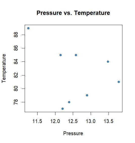
Here, the above snippet shows a scatter plot that displays the correlation between the Pressure and Temperature columns of the dataframe.