Exploratory Data Analysis is an essential step in understanding your dataset’s structure, relationships, and potential issues.To perform Exploratory Data Analysis you can use dplyr, ggplot2 and summarytools package. Follow below steps to perform exploratory data analysis in R.
Step 1: Load dataset
First we need to import necessary packages and load dataset:
library(tidyverse)

# Load diamonds dataset
data(diamonds)
Here we load diamond dataset from tidyverse package.
Step 2: Summarize the data
Use summary() function to summarize the data:
# Get statistical values
summary(diamonds)
Output:
   carat               cut        color        clarity          depth           table
 Min.   :0.2000   Fair     : 1610   D: 6775   SI1    :13065   Min.   :43.00   Min.   :43.00
 1st Qu.:0.4000   Good     : 4906   E: 9797   VS2    :12258   1st Qu.:61.00   1st Qu.:56.00
 Median :0.7000   Very Good:12082   F: 9542   SI2    : 9194   Median :61.80   Median :57.00
 Mean   :0.7979   Premium  :13791   G:11292   VS1    : 8171   Mean   :61.75   Mean   :57.46
 3rd Qu.:1.0400   Ideal    :21551   H: 8304   VVS2   : 5066   3rd Qu.:62.50   3rd Qu.:59.00
 Max.   :5.0100                     I: 5422   VVS1   : 3655   Max.   :79.00   Max.   :95.00
                                    J: 2808   (Other): 2531
     price             x                y                z
 Min.   :  326   Min.   : 0.000   Min.   : 0.000   Min.   : 0.000
 1st Qu.:  950   1st Qu.: 4.710   1st Qu.: 4.720   1st Qu.: 2.910
 Median : 2401   Median : 5.700   Median : 5.710   Median : 3.530
 Mean   : 3933   Mean   : 5.731   Mean   : 5.735   Mean   : 3.539
 3rd Qu.: 5324   3rd Qu.: 6.540   3rd Qu.: 6.540   3rd Qu.: 4.040
 Max.   :18823   Max.   :10.740   Max.   :58.900   Max.   :31.800
Here the output shows statistical values of each column of dataset.
Step 4: Visualize Dataset
You can use ggplot2 package to visualize dataset:
# Create histogram of values for price
ggplot(data=diamonds, aes(x=price)) +
  geom_histogram(fill="steelblue", color="black") +
  ggtitle("Histogram of Price Values")
Output:
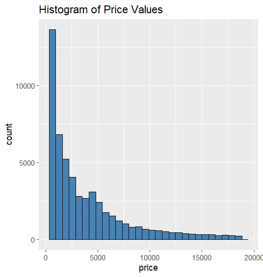
Here the above snippte shows histogram which created using geom_histogram() function on price column of dataset.
# Create scatterplot of carat vs. price, using cut as color variable
ggplot(data=diamonds, aes(x=carat, y=price, color=cut)) +
  geom_point()
Output:
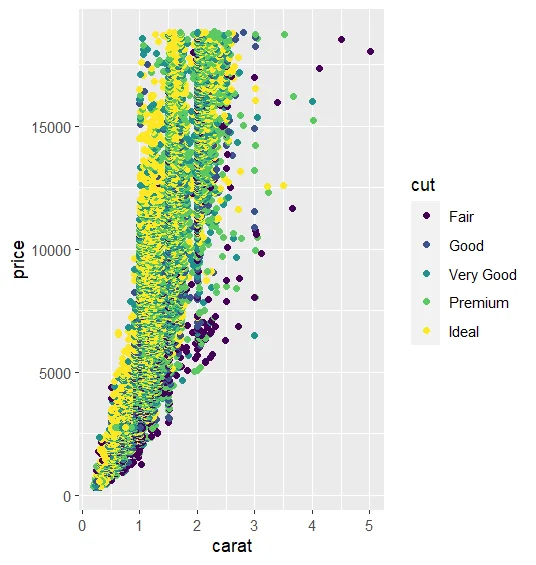
The above snippet shows scatter plot created using geom_point() function.This scatterplot shows the correlation between carat and price column of dataset.
# Create boxplot of price, grouped by cut
ggplot(data=diamonds, aes(x=cut, y=price)) +
  geom_boxplot(fill="steelblue")
Output:
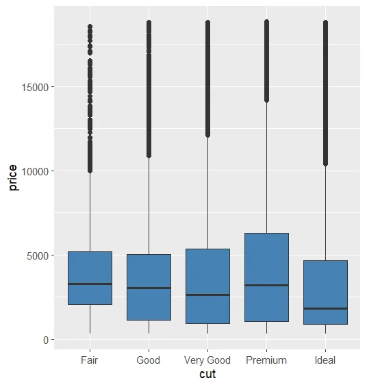
The snippet shows box plot created using geom_boxplot() function which shows boxplot for price column which is group by cut column of dataset.