Univariate analysis involves summarizing and visualizing a single variable in a dataset. This involves calculating statistical values, calculate frequency table and plotting charts.
The following method shows how you can do it with syntax.
Method 1: Calculate Statistical Values
# Calculate mean
mean(df$column)

# Calculate median
median(df$column)

# Calculate difference between max and min value
max(df$column)-min(df$column)

# Calculate IQR
IQR(df$column)

# Calculate standard deviation
sd(df$column)
Method: Create Frequency Table
table(df$column)
Method: Plotting Chart
# Create boxplot
boxplot(df$column)

# Create histogram
hist(df$column)

# Create density curve
plot(density(df$column))
The following examples show how to perform univariate analysis of dataset in R.
Calculate Statistical Values
Let’s see how we can calculate statistical values of one of the column of dataframe using different functions:
# Create data frame
df <- data.frame(Machine_name=c("A","B","C","D","E","F","G","H"),
                 Pressure=c(12.39,11.25,12.15,13.48,13.78,12.89,12.21,12.58),
                 Temperature=c(78,89,85,84,81,79,77,85),
                 Status=c(TRUE,TRUE,FALSE,TRUE,FALSE,FALSE,TRUE,FALSE))

# Calculate mean
mean(df$Pressure)

# Calculate median
median(df$Pressure)

# Calculate difference between max and min value
max(df$Pressure)-min(df$Pressure)

# Calculate IQR
IQR(df$Pressure)

# Calculate standard deviation
sd(df$Pressure)
Output:
[1] 12.59125

[1] 12.485

[1] 2.53

[1] 0.8425

[1] 0.7992753
Here the output shows different statistical values of Pressure column of dataframe.
Create Frequency Table
To create frequency table use table() function. This function gives the count of repeated value in particular column of dataframe.
# Create data frame
df <- data.frame(Machine_name=c("A","B","C","D","E","F","G","H"),
                 Pressure=c(12.39,11.25,12.15,13.48,13.78,12.89,12.21,12.58),
                 Temperature=c(78,89,85,84,81,79,77,85),
                 Status=c(TRUE,TRUE,FALSE,TRUE,FALSE,FALSE,TRUE,FALSE))

# Create frequency table
table(df$Temperature)
Output:
77 78 79 81 84 85 89
 1  1  1  1  1  2  1
Here the above output shows repeated values in Temperature column of dataframe.
Plotting Charts
You can create different types of charts for analysis like boxplot,histogram,etc.
# Create data frame
df <- data.frame(Machine_name=c("A","B","C","D","E","F","G","H"),
                 Pressure=c(12.39,11.25,12.15,13.48,13.78,12.89,12.21,12.58),
                 Temperature=c(78,89,85,84,81,79,77,85),
                 Status=c(TRUE,TRUE,FALSE,TRUE,FALSE,FALSE,TRUE,FALSE))

# Create boxplot
boxplot(df$Pressure)

# Create histogram
hist(df$Pressure)

# Create density curve
plot(density(df$Pressure))
Output:
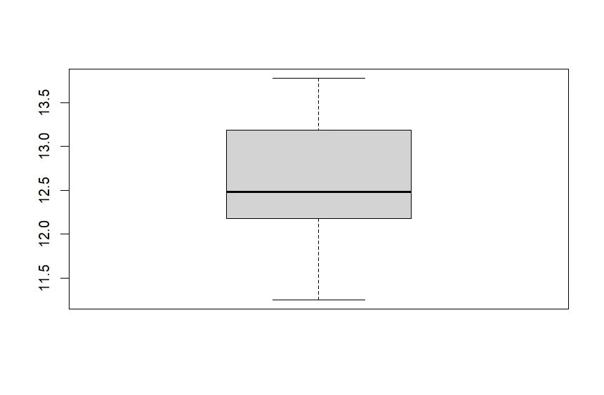
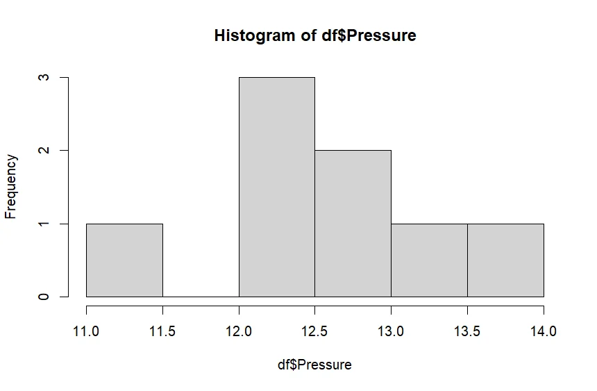
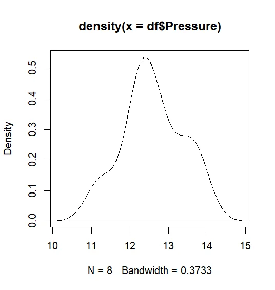
Here the above snippet shows different charts created for analysis