To create a line chart in R, you can use the plot() function or the ggplot() function from the ggplot2 package.
In this article, we will explore how to create a line chart in R using these methods with examples.
Method 1: Use plot() Function
The plot() function in R is used to create various types of plots, including line charts. Here’s the syntax:
plot(x, y, type = "l", col = "blue", lwd = 2, xlab = "X-axis label", ylab = "Y-axis label", main = "My Line Chart")
The following example shows how to create a line chart using the plot() function:
Create a Line Chart Using plot() Function in R
Let’s see how to use the plot() function in R:
# Sample data
x <- c(1, 3, 5, 7, 9, 11, 13, 15, 17, 19)
y <- c(2, 4, 6, 9, 12, 15, 16, 13, 7, 5)

# Build the line chart
plot(x, y, type = "l", col = "blue", lwd = 2, xlab = "X-axis label", ylab = "Y-axis label", main = "My Line Chart")
Output: 👇️
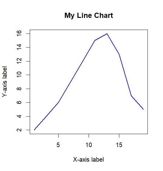
Here the above snippet shows a line chart for the data that we declared in the above code.
Create a Line Chart Using ggplot() Function in R
The ggplot() function from the ggplot2 package is used to create complex and customizable plots, including line charts. Here’s the syntax:
ggplot(df, aes(x, y)) + geom_line() + xlab("X-axis label") + ylab("Y-axis label") + ggtitle("My Line Chart")
The following example shows how to create a line chart using the ggplot() function:
library(ggplot2)

# Create data frame
df <- data.frame(Start_date=as.Date(c("2000-05-21","2000-05-22","2000-05-23","2000-05-24","2000-05-25","2000-05-26")),
                 Machine_name = c("Machine1","Machine2","Machine1","Machine3","Machine2","Machine3"),
                 Value = c(108,120,135,95,98,105),Reading= c(110,97,91,89,80,85))

# Plot line chart
ggplot(df, aes(Start_date, Value, group=Machine_name, colour=Machine_name)) +
  geom_line() +
  xlab(label='dates') +
  ylab(label='value')
Output: 👇️
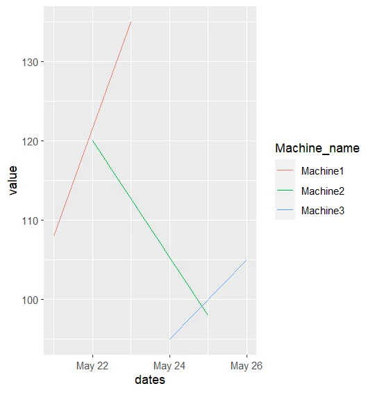
Using the above code, we can plot a line chart for time series data.